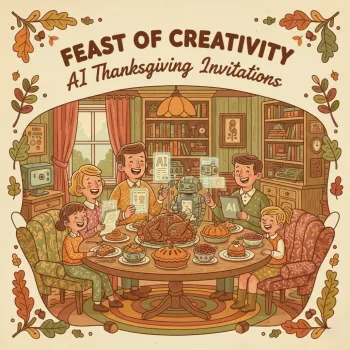
Thanksgiving invitations set the tone before guests ever arrive. A well-made invite signals warmth, clarity, and care—whether the plan is a casual potluck, a polished sit-down dinner, or a cozy Friendsgiving. The Feast of Creativity: AI Thanksgiving Invitations digital download is built for hosts who want invitations that feel intentionally designed, without starting from a blank page. It combines a repeatable wording workflow (with ChatGPT) and consistent visual direction (with MidJourney), plus printable support materials that keep every detail straight. For more guidance, see Free Thanksgiving Invitation Templates & Tips 2025.
For anyone experimenting with AI-assisted design, it helps to cross-check platform guidelines and capabilities. The OpenAI Help Center and Midjourney Documentation are solid references when you want to understand settings, account access, and general best practices. For further reading, see Free Thanksgiving Invitation Templates: Customize & ….
Before writing a single line, decide how the invitation should feel. A consistent style choice makes every later decision easier: palette, illustration vibe, typography, and even wording cadence.
Lock in the size (5×7 or A6 are common), delivery method (email/text vs. print), and RSVP method (phone, email, or form link). These three decisions determine layout space, font sizes, and how “detail-heavy” your invitation can be without feeling crowded.
Build the invitation copy in modules: host line, event title, date/day/time, address, RSVP line, then optional notes (parking, allergies, what to bring). When the information is modular, it’s easy to switch between casual and formal without losing the essentials.
Pick one cohesive style direction and iterate variations rather than changing styles every attempt. Consistency is what makes an invite look “designed.” Prioritize a composition with a calm area where text can live—busy centers and high-contrast patterns usually fight the typography.
Keep the artwork and the invitation text separate. Generate images without embedded words, then add typography in a layout tool so the date, time, and address remain readable at both phone and print sizes. If you’re printing, resources like Canva’s print design tips are helpful for understanding bleed, margins, and proofing.
Check hierarchy (what you read first), accessibility (contrast and font size), and spacing. Export, send a proof to a friend, view on mobile, and print a single test page before committing to a full batch.
The most “professional” invitations aren’t the fanciest—they’re the ones guests can act on instantly. That means clarity first, with warmth woven in.
| Invitation direction | Best for | Visual cues | Recommended output |
|---|---|---|---|
| Cozy & classic | Family dinners and mixed-age guests | Warm lighting, pumpkins, soft textures | 5×7 print + mobile-friendly PNG |
| Modern minimal | Friendsgiving, apartments, casual-host chic | Whitespace, muted tones, clean type | Digital-first invitation + RSVP link |
| Rustic farmhouse | Country homes, potlucks, outdoor gatherings | Kraft/wood textures, vintage botanicals | Print with matching potluck sign-up card |
| Elegant dinner | Formal sit-down dinners | Dark palette, gold accents, serif type | Print + matching menu card |
No—standard image files (PNG/JPG) open on most phones and in email without extra apps. For accessibility and peace of mind, include the key details (date, time, address, RSVP) in the message body too, and test the invite on mobile before sending to everyone.
Yes. Keep a consistent palette and a single art direction, then generate a small coordinated set (backgrounds, borders, icons) so your invitation, menu card, and place cards feel like one unified suite.
Generate artwork without embedded text, then add your typography in a layout tool so the details remain sharp at both screen and print sizes. This also makes it easier to update times, addresses, and RSVP lines without regenerating the entire image.



Leave a comment